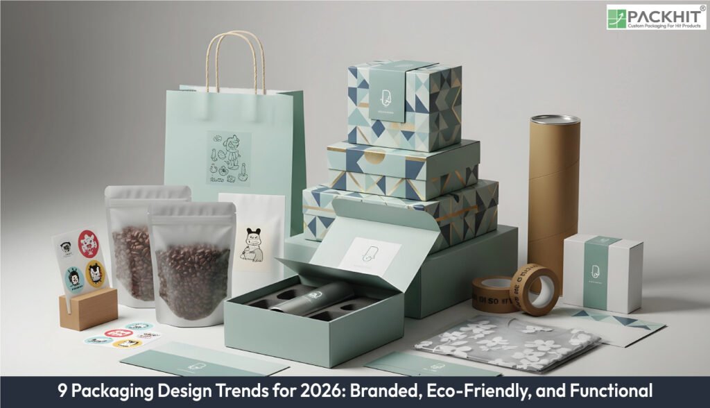
The nine packaging design trends for 2026 include bold typography, monochrome brand pallets, recyclable fibre materials, refill-ready formats, minimal ink graphic layouts, interactive QR layers, resealable function closure, moisture control inserts, and transparent windows. Bold typography and monochrome brand palettes strengthen shelf impact through oversized letterforms and single-hue grids that keep packs readable at a distance while reducing ink passes during long print runs. Recyclable fibre materials and refill-ready formats reinforce sustainability by replacing plastic layers with FSC-certified board and enabling repeated use of rigid outers, cutting material use across cycles. Minimal-ink graphic layouts support these efficiencies with thin-line drawings and single-plate passes that stay stable on uncoated substrates. Interactive QR layers extend information without crowding the primary face, while resealable functional closures maintain product freshness through repeated openings. Moisture-control inserts further protect biscuits, nuts, and dry snacks by managing humidity during storage and transport. Transparent windows complete the system by offering real product visibility so shoppers can quickly evaluate colour, texture, and portion size before choosing a pack.
The nine packaging trends for 2026 are listed below:
- Bold Typography
- Monochrome Brand Pallets
- Recyclable Fibre Materials
- Refill-ready Formats
- Minimal Ink Graphic Layouts
- Interactive QR Layers
- Reseable Function Closure
- Moisture‑Control Inserts
- Transparent Windows
1. Bold Typography
Bold typography systems use oversized letterforms, dense stroke weights, and direct wording that increase shelf distinction. Food packaging examples include tea cartons and cookie sleeves that use tight grids and 1–2 colour type blocks. Brands often push these heavier forms when they want quick pattern recognition on crowded shelves, especially across categories such as snack boxes or canned drinks. The approach holds attention at a distance, and it works with monochrome palettes that reduce ink layers if speed and consistency matter during long print runs.
2. Monochrome Brand Palettes
Monochrome brand palettes use one dominant hue with restrained accent tones that keep print passes low and keep registration shifts controlled during long runs. The format cuts ink layers by about 20% and keeps colour drift predictable if presses run multiple substrates. Beer cans, dry‑goods boxes, and food packs use these single‑hue grids to keep labels readable at a distance and to keep cost per unit stable during seasonal updates.
3. Recyclable Fibre Materials
Recyclable fibre materials use FSC-certified board, uncoated kraft variants, or thick pulp trays that cut plastic layers in outer wraps. Food packs pinned across packaging boards, such as tea sleeves or cookie cartons, shift toward these fibres because the substrates keep print colour stable on uncoated surfaces. Brands add simple line grids or one‑tone blocks if fibre textures absorb ink quickly and reduce plate clarity during long print runs. The format reduces composite waste, as single‑material packs enter fibre recovery streams without separation.
4. Refill‑Ready Formats
Refill‑ready formats use rigid outers combined with flexible liners that slot into the shell without extra adhesives. Dry food, drink powders, and personal‑care packs use these systems because the process cuts recurring material by about 60% per refill cycle. The outer shell keeps shape stability during transport, if pallet stacks reach higher loads, while the inner liner collapses flat after emptying. The format keeps branding stable across long use periods because each refill cycle repeats the same outer shell and maintains colour alignment across the printed panels.
5. Minimal-Ink Graphic Layouts
Minimal‑ink graphic layouts rely on sparse icon groups, thin‑line drawings, and single‑plate passes that keep abrasion low during long runs. Many food packs pinned in packaging boards, such as cookie boxes or tea sleeves, use this layout because the restrained ink layer keeps fibre substrates from over‑absorbing colour. The method keeps registration steadier on uncoated board, if humidity shifts during storage cause sheet expansion. Packs with short text fields and simple grids often suit this format because the layout maintains clarity even after repeated handling.
6. Interactive QR Layers
Interactive QR layers add compact scan fields for recipe steps, storage details, or allergen lists taken from common user questions. Boards featuring tea cartons, beer cans, or snack pouches often place the code near seams to avoid crowding the primary face. The module keeps print density low because a single black layer is enough for reliable scanning. These QR fields guide shoppers to longer instructions if the pack panel cannot hold extended text without cluttering the brand mark.
7. Resealable Functional Closures
Resealable functional closures use zip locks, tab locks, and slide rails for repeated openings. Coffee bags, biscuit pouches, and powdered drink packs depend on these closures to slow aroma loss or moisture shift. Food packs highlight these parts because the closure supports portion-based use and keeps panel surfaces intact during handling. The closure line maintains its position across long runs if substrate tension shifts during storage.
8. Moisture‑Control Inserts
Moisture‑control inserts use vent channels, micro‑perforated liners, and board cavities that hold humidity within a defined band. Biscuit sleeves, roasted‑nut pouches, and dry snack trays rely on these inserts to slow staling across warehouse periods. Tea cartons and cookie boxes use similar internal parts because the structures protect the fibre walls from softening. The insert locks against the inner surface and resists movement if transport pressure shifts during stacking.
9. Transparent Windows
Transparent windows use cut‑out panels with clear film that shows portion size, colour, and texture of items such as biscuits, teas, or mixed snacks. Pinterest boards highlight these windows because they support quick product checks and reduce returns. The film sits tight against the board, if transport pressure increases during stacking. This format guides quick decisions during shelf scanning, as the visible item becomes the main cue.

